
Previously on "How to Enhance Algo Trading Win Rate with ML":
If you want to maximize the performance of developing and coding, please read "How to Enhance Algo Trading Win Rate with ML: Labelling Data" before proceeding.
We started labeling data using our algorithmic strategy in the first article of this series and then corrected the labels through backtesting to gain maximum profit from the strategy.
Next, we are going to select suitable features to feed our machine learning model.
How to Enhance Algo Trading Win Rate with ML: Feature Selection
The selection of features is one of the most important techniques of machine learning because it serves as a fundamental method to direct variables to what is most efficient and effective for a given machine learning system. There are many methods to accomplish that but we’re just going to practically use some simple rules in this article.
Our experiment will be implemented in the "Jupyterlab" environment. Clone the improve_algorithmic_trading_ml repository and run the 2-feature_selection.ipynb for a better understanding.
Block [1-3]
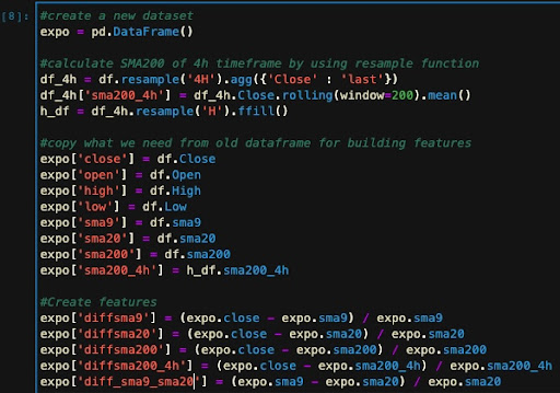
We will begin by importing the dataset we saved in the previous step, which includes Binance OHLC data and some custom indicators we have added.
Block [4-14]
Data variance is the first rule to consider for selecting a feature. The data point or array may be essentially meaningless if there is no variance. If the variance is exceedingly high, it may deteriorate into "noise," or unimportant, arbitrary outputs that are difficult to handle for the machine learning system. By visually analyzing your data, you can always gain an understanding of the distribution and other characteristics of each variable. You can use various charts for visualization in your experiments by importing these two libraries:
- Matplotlib: https://matplotlib.org
- Seaborn: https://seaborn.pydata.org
For example, suppose we want to determine if 'Close' is a good variable to choose as a feature. Using a histogram plot, we can examine the distribution of this variable rate through our dataset.
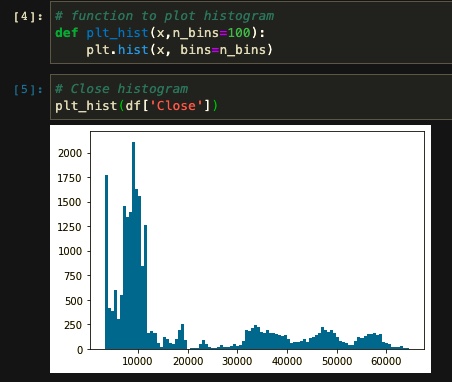
As you see, 'Close' is not the best option because we need some features that have a normal distribution. We can say the same about other columns in our dataset. Therefore, we need to figure out how to build useful features.
In addition to a normal distribution, we need to consider whether our new features are aligned with our strategy. For example, let’s see if the difference between SMA9 and SMA20 (Our rule for labeling the data in the strategic algorithm) can be a good feature for the machine or not.
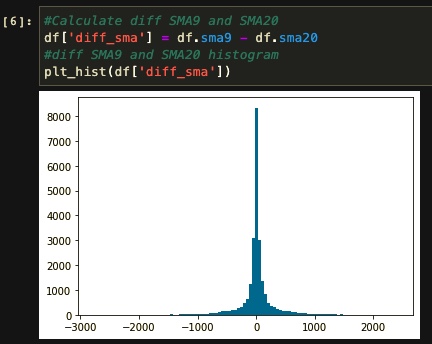
Well, the distribution here is closer to normal, but there is still one more problem to fix. You can see that our feature range stands between -1500 and 1500. By having such a wide range of values in a feature, the model will misinterpret the data while training and generate useless results. So we divide the “SMA9 - SMA20” by SMA20 to reach a range between -1 and 1.
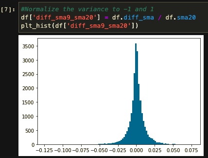
In our experience, diff_sma9_sma20 is now a valuable feature, but if we feed only that, we cannot expect much improvement in the model compared to our algorithm. Therefore, we built some features so that the model can better understand the characteristics of our labeling algorithm. For that, we copy our dataset columns, calculate our new features, and then remove the useless columns for further steps. Building features on this step is based on these rules:
-They should somehow help the machine to better understand how our algorithm work. (Here we have a trend-based strategy so we use trend-based features and indicators).
- They should have a normal distribution and a suitable range between -1 and 1. (We can achieve that by using a histogram plot and visualizing every feature).
Block [15 - 16]
The other rule we should consider is to avoid using correlated features. This can be achieved by using the heatmap plot. The correlation between each pair of features is represented by a value ranging from 0 to 1. Lighter colors indicate more correlated values, while darker shades indicate fewer connected parameters.
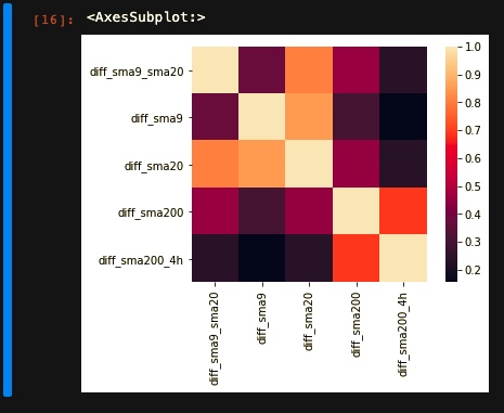
In our experiment, we take diff_sma9_sma20 as our main feature. Then we try to select less correlated features to that for the training phase. For example, in this heatmap, you can see that diff_sma20 has relatively a lot correlation with our main feature so we avoid using it in our training.
Block [17-22]
The last thing to consider about features is how they cover our labels. For example, we take our long label as our target and see how our feature distribution is based on our target. We can visualize it with the help of seaborn’s pairplot function. To better understand this chart you should notice that:
- Long-labeled features are marked in orange color.
- A line plot is a single feature distribution throughout the relative labels.
- Dot plots are a pair of feature distributions throughout the relative labels.
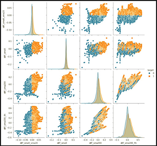
For example “diff_sma9_sma20” is a good feature individually cause it has variant distribution through labels. Similarly, "diff_sma9_sma20" and "diff_sma9" are good pairs of features. This way we may determine whether or not to maintain helpful features based on how they're distributed via their relative labels.
Finally, we divide our dataset into two training and validation sets for further usage.
Remember that all of the phases in this article form a loop, and you may go back and explore a feature at any moment. Also, the whole steps are not the exact roadmap to finding suitable features; You may be able to find more efficient ways to test your features and don’t be afraid to train your features and change them if they don't work out.
In the next article, we'll talk about how to train our model using the TensorFlow Keras library and backtest the results to check whether we have improved or not.