Previously on "How to develop":
If you want to maximize the performance of developing and coding, please read "How to design a machine learning trading bot - Part 2: Data Analysis" before proceeding.
Next, let's look at the development.
Data analysis is a key component of machine learning. When combined with the numeric data from the finance market, it becomes even more significant. The articles in this series are designed as educational material. As a result, the complex problem is simplified to a very simple one. This study also uses basic data to demonstrate how they can be analyzed. Ultimately, we are exploring how we can improve trading via machine learning in this series of articles.
Data Analysis:
The previous article discussed how to collect OHLCV data (stream data) and how to use historical data. We utilize historical data to train a machine and stream data to make predictions based on that model.

At this step, we need the historical data, which we use the following repository: 1H.csv
In the CSV file, you will find Binance 1 hour OHLCV, which starts on 2017-09-05 and ends on 2021-06-01.
We are exploring the code in Jupyterlab this time. Jupyterlab provides a better environment, for education and research objectives.
crypto_data_analysis and analysis.ipynb
Block [1-3]
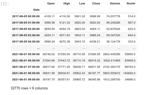
First, let's see what we have in our data. We'll just show the table of data from the CSV file. Note that we need to reformat the date from string to DateTime, and set it as an index.
Block [4-6]
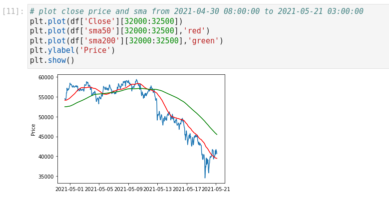
We have two plots with close prices. The first shows the entire data frame. The second one displays a chart of the close price from 2021-04-30 08:00:00 to 2021-05-21 03:00:00. This helps you understand how the data set works.
Don't be afraid to visualize your data. It will help you in your analysis. Here are the two most useful Python libraries we will be using for plots:
Matplotlib: https://matplotlib.org
Seaborn: https://seaborn.pydata.org
Block [7-8]:
We are using cleaned data here, and the missing data has been fixed earlier. Before you continue, you must review your data and correct any incorrect and missing data. As an example, we just check if there are any nulls in the Close column.
Block [9-11]:
Let's add some moving averages of Close (SMA9, SMA20, SMA50, SMA200) to the data frame. Visualize a chart with both the SMA50 and SMA200 included.
Now, let's review two main keywords in data analysis:
1- Feature
2- Label
In the next article, we'll discuss labels in greater detail. This time we're focusing on features.
Selecting the right feature is crucial. Here is the feature definition (from the Google machine learning crash course) again before we go any further:
A feature is an input variable—the x variable in simple linear regression. A simple machine learning project might use a single feature, while a more sophisticated machine learning project could use millions of features.
Imagine that we have a set of car prices like the following and we want to predict a given car's price:
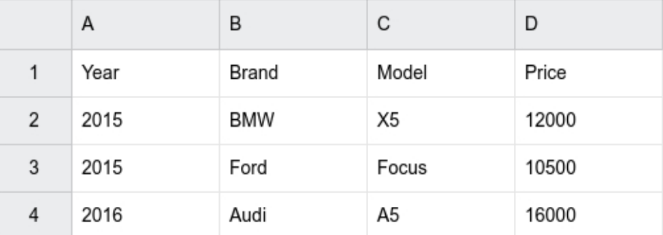
The Price is our Label, and the Year, Model, and Brand are our Features.
Back to our data, we need to find some features to feed our machine.

Is the feature we need already included in our data set, or should we build it?
Is the close rate a helpful feature to select?
What about the Label? Do we plan to predict the price? Are there any other plans?
We will not predict the price in this study, which means the close rate will not be labeled.
Block [12-13]
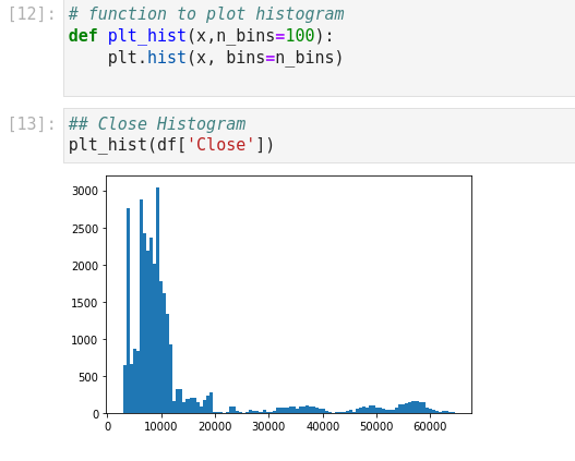
Neither Close nor Open can be a feature. Even if you normalize the rate, you can still get a different rate than the machine is trained with.
You can see how Closes are distributed by visualizing the histogram of the Close rate. If you want to select a feature, the histogram should resemble a normal distribution.
Block [14-20]
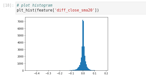
None of these columns in our data frame could be a potential feature for us. This leads us to build one. Let's add a new column for the difference between the close and the SMA 20. You can see from the histogram that it is much more similar to a normal distribution than before. But, still, something is wrong here. Close and SMA 20 have a variance between -2000 and +2000. This indicates our updated feature is still dependent on the Close price. So, by dividing the result by the Close rate we can change the variance to -0.1 and +0.1. And the machine loves this range of numbers :)
Block [21-24]
Let's look at a few useful functions before we finish this section:
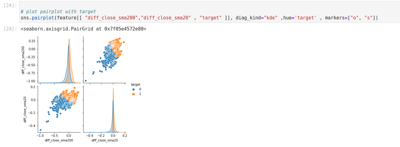
By plotting the correlated heatmap, you can identify which features are correlated and avoid using them. The behavior of diff_close_sma20 and diff_close_sma200 in the example is so similar. In practice, that could be quite sufficient.
We will talk more about the label in the next article, but to make it more practical, consider this rule for the label:
A close price that is greater than SMA50 is labeled 1 and vice versa labeled 0.
Using Pairplot, we can see how the features cover the target.